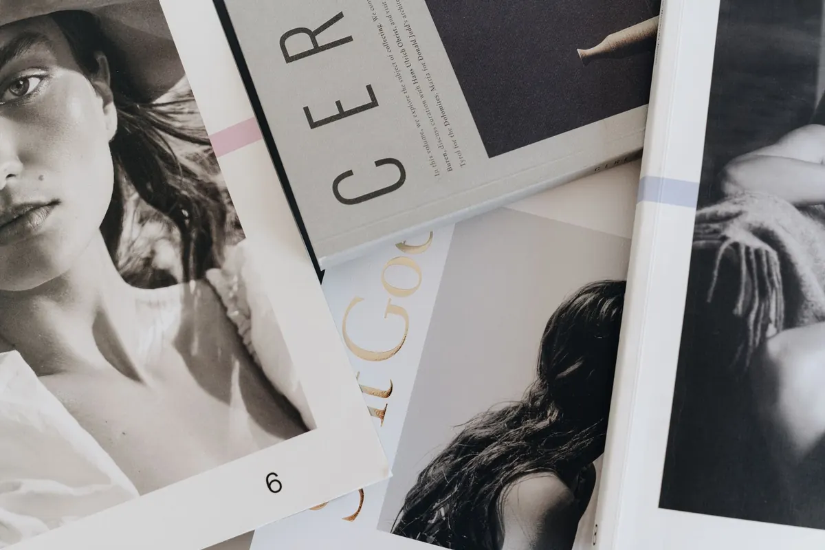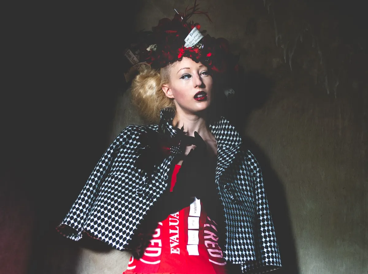


A comp card is the smallest, cheapest piece of marketing you own, and the one that works hardest. It gets handed to bookers at open calls, attached to email submissions, tucked into a folder after a go-see. Some cards get pulled out again and again for months. Most get filed, forgotten, or thrown away within a week. The difference rarely comes down to budget or a famous photographer. It comes down to whether the card answers a booker's questions in the five seconds they give it.
What the Card Is Actually For
A comp card — composite card, or zed card in some markets — is a miniature portfolio on paper. Its job is not to be beautiful. Its job is to make three things obvious at a glance: what your face and body look like without heavy styling, what type of model you read as, and how to reach you or your agency.
Bookers work through stacks. They shortlist, file, and come back later. A card that gets kept has images that read at arm's length, stats that are correct, and contact details where the eye expects to find them. A card that gets tossed is usually one where the booker could not tell what you look like. Harsh, but useful.
The digital version matters just as much. Most submissions now happen by email, so treat the PDF as the primary card and the printed one as what you carry to meetings.
Choosing Images: Build a Core of Four
Four images is the standard. Six is fine if every one earns its place. Fewer than four and you look unfinished. Use these roles as your starting structure:
- Lead head-and-shoulders. Direct eye contact, minimal makeup, hair off your face, plain background. This is the shot that decides whether they look at the rest.
- Full length. Your whole body in frame, feet included, in fitted plain clothing — jeans and a simple top work fine. Don't hide behind loose layers or crop yourself at the ankles.
- Commercial or lifestyle. A genuine smile, natural light, approachable energy. This is the frame that gets you considered for catalog, advertising and brand work.
- Editorial or character. One image that shows you can hold a mood and take direction.
Leave off anything a booker cannot read. Sunglasses, hats, or hair over the eyes. Group shots. Images where you are a small figure in a wide landscape. Retouching that erases your skin texture, and filters that change the shape of your face. Be careful with black and white, too: a full black-and-white card as a deliberate design choice is fine, but don't convert a single image to hide bad lighting or a hair colour you have gone off. Agencies need to know what walks into a casting.
Show Range, Not a Different Person
Range on a comp card means range of expression and styling — not range of identity. If your hair, makeup and lighting shift so dramatically between images that a booker has to check the name twice, the card works against you. Aim for pictures that clearly belong to the same person on the same day.
There is a real tension here. Most models can read as more than one type: commercial and editorial, or athletic and soft beauty. Trying to show all of it on one card usually produces a card that says nothing clearly. If you are signed, ask your booker whether two cards make sense — plenty of represented models keep a commercial card and a fashion card. If you are unsigned, one clean, focused card beats two confused ones every time.
Layout and Stats: Keep It Boring on Purpose
Standard size is 5.5 by 8.5 inches in the US, close to A5 (148 by 210 mm) in Europe. Portrait orientation is most common because it fits a full-length shot beside a head shot without shrinking either one.
A layout that works: lead image large at the top, full length beside it at the same height where possible, the remaining two to four images in a row beneath, and the stats in a clean strip along the bottom or in the margin.
Use two fonts maximum — one for your name, one for everything else. No script, no drop shadows, no text over the busiest part of a photo. Put your name small in the corner of every image. Cards get separated, photocopied and scanned, and an unlabelled JPEG floating around a booker's desktop is useless to everyone.
Your stats block should include:
- Name, and agency if you have one
- Height
- Measurements in the units your market uses
- Dress or suit size, and shoe size
- Hair colour, eye colour
- Base city
- Email and phone
Check what your market expects. Some places want age or an age range; some boards don't want measurements listed at all. Your agency will tell you, and if you're unsure, ask before you print.
Printing and Digital Files
Print a small run first. Order enough to get through the next few months of go-sees, live with the card for a week, then reorder if you still like it. Printing costs vary widely by printer, paper and quantity, so compare a few options before committing to a large batch.
Matte or satin finishes tend to photograph better and hold up to handling; heavy gloss reflects light and shows every fingerprint. Pick a paper with enough weight to feel substantial but not so thick that the card won't sit flat in a stack.
For the digital version, export the same layout as a PDF. Keep the file size sensible so it doesn't clog someone's inbox, and name it clearly — FirstnameLastname_compcard.pdf, not IMG_4821.pdf. Send individual JPEGs named the same way, since bookers often need single images for boards and client submissions.
Test It Before You Send It
Run the card through these checks:
- Squint test. Stand back and squint. Can you tell where the face is, and read the name and email? If not, the hierarchy is wrong.
- Phone test. Open the PDF on a phone at full size. Most first impressions happen on a small screen.
- Stats check. Read every number aloud against your agency's records. Wrong measurements cause real problems at castings.
- Stranger test. Show it to someone who doesn't know you and ask what type they would cast you as. If their answer matches your intention, the card is working.
- Photocopy test. Print it in black and white. If the images collapse into grey mush, your contrast and lighting choices need another look.
- Freshness. Every image should be recent. If you have cut your hair or changed weight since the shoot, book another one.
Treat the Card as a Working Tool
A comp card is something you use, not a keepsake. Revisit it twice a year, replace the weakest image, and leave the rest alone. Resist redesigning it every time you shoot; consistency is what makes your card recognisable in a stack.
If you're signed, run changes past your agency before printing. Your booker may have a clear preference for how you're presented, and they know which clients you're being pitched to. If you're looking for representation, remember that no card guarantees interest — it simply removes the reasons to say no. Keep the images honest, the layout plain, and the contact details impossible to miss.